RS Group Unveils New Logo to Pass on New Legacy
Merging Strong Entertainment with Growing Commerce
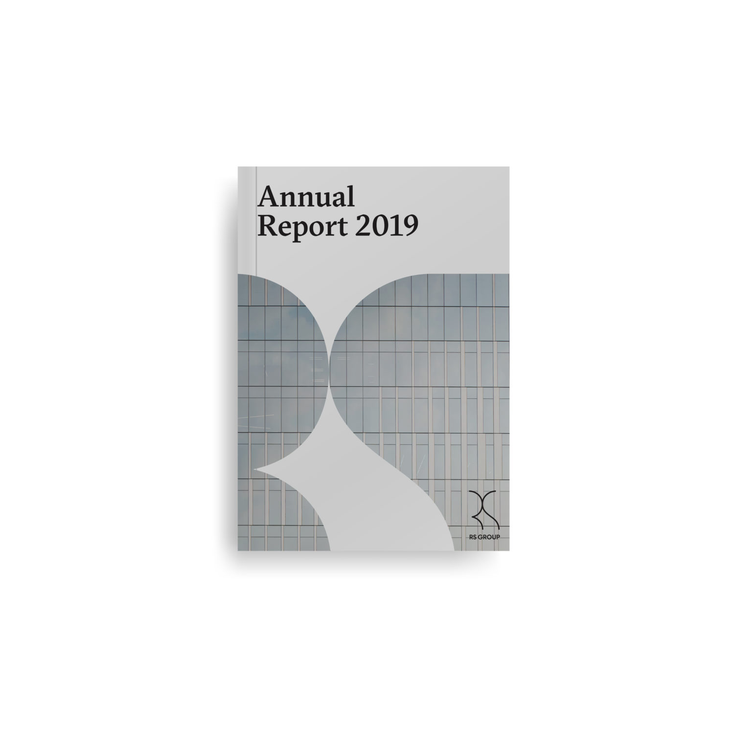
RS Group declares its internal re-organization and transformed its brand image according to the new vision, mission, and business model known as ‘Entertainmerce’. New board members have been announced since early 2020, followed by a new logo with modern, minimalistic, and international touch. The new logo and brand identity are the results of collaboration with Marina Willer, a highly skilled graphic designer who designed the logo for Tate Modern, a famous British museum. The collaboration aims at highlighting the new normal of RS Group.
Bravery to disrupt itself
With expertise in the entertainment business, RS has grown significantly and become a group of companies as suggested by the word ‘Group’ being added to its name. furthermore, the company has been relabeled from the entertainment industry to the commerce industry in the Stock Exchange of Thailand. This change aims to reaffirm investors and consumers that RS is not running only the media and entertainment, but the company has set foot in the commerce industry for over four years. Disrupting itself under the ‘Entertainmerce’ business model, RS has proven that it is moving toward the right direction. The company’s revenue and profit have rocketed by hundreds of percent. To keep up with the world, RS has modified its business strategies and introduced new technologies that suit the context and environment of each subsidiary. The company organization has also been restructured to be more flexible. Manpower has been prepared to serve the new corporate value so that RS Group stands firmly and grow sustainably.
Collaborating with designer from top designing firm
This step has led RS Group to the new legacy. The most outstanding change is a new logo. The new logo suggests that RS is transforming its entire thinking process. In this rebranding attempt, RS has been collaborating with Marina Willer, the famous art director from Pentagram whose masterpiece is designing the logo for Tate Modern in England. With its unique design, this logo proves a timeless design because it still looks modern despite over 20 years of age. This is how Willer reflected on the importance of a logo.

“A logo must be outstanding to be different and make a difference. The logo summarizes the heart and soul of a corporate so that people understand the corporate identity in a blink of an eye. Visual identity is one of the mechanisms that create the interconnection between the brand and people. This is because the logo raises awareness immediately even in a rush moment, especially in the current world where media approach us from every direction.”
Willer also revealed her inspiration for the new RS logo that she designed. “RS Group is a huge corporation that has initiated many businesses through creative impetus and operated several types of businesses. The company is like the skeleton of our bodies. With a strong skeleton that functions well, our body can grow and hold smaller parts seamlessly, regardless of the different sectors its subsidiaries may be in. Also, it does not necessarily mean that the corporate has to outstand other brands in the group. So, the logo of RS needs to have profound meaning, modern design, and clever implication. It is trying to communicate that RS group, as the central part, is ready to support the subsidiaries and functions as the nursery for other businesses to grow endlessly. The designer team tried to understand the unique and different characteristics of the ‘Entertainmerce’ business model that combines entertainment and commerce, along with the company’s vision to move forward before crafting the logo. Working closely together is the key to convey the spirit and model of business that create the most accurate scope of being RS Group”, said the designer.
The new legacy to deliver more joy to people
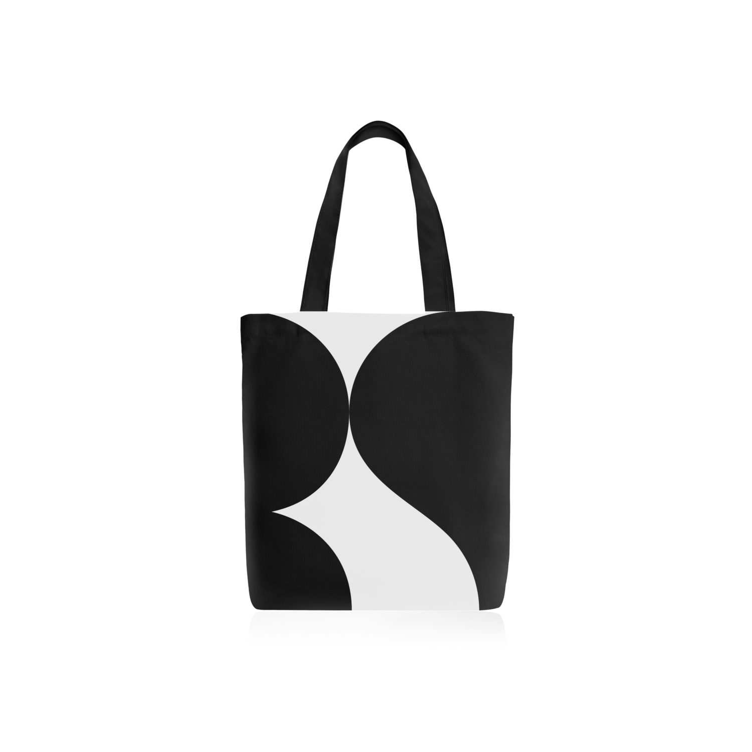
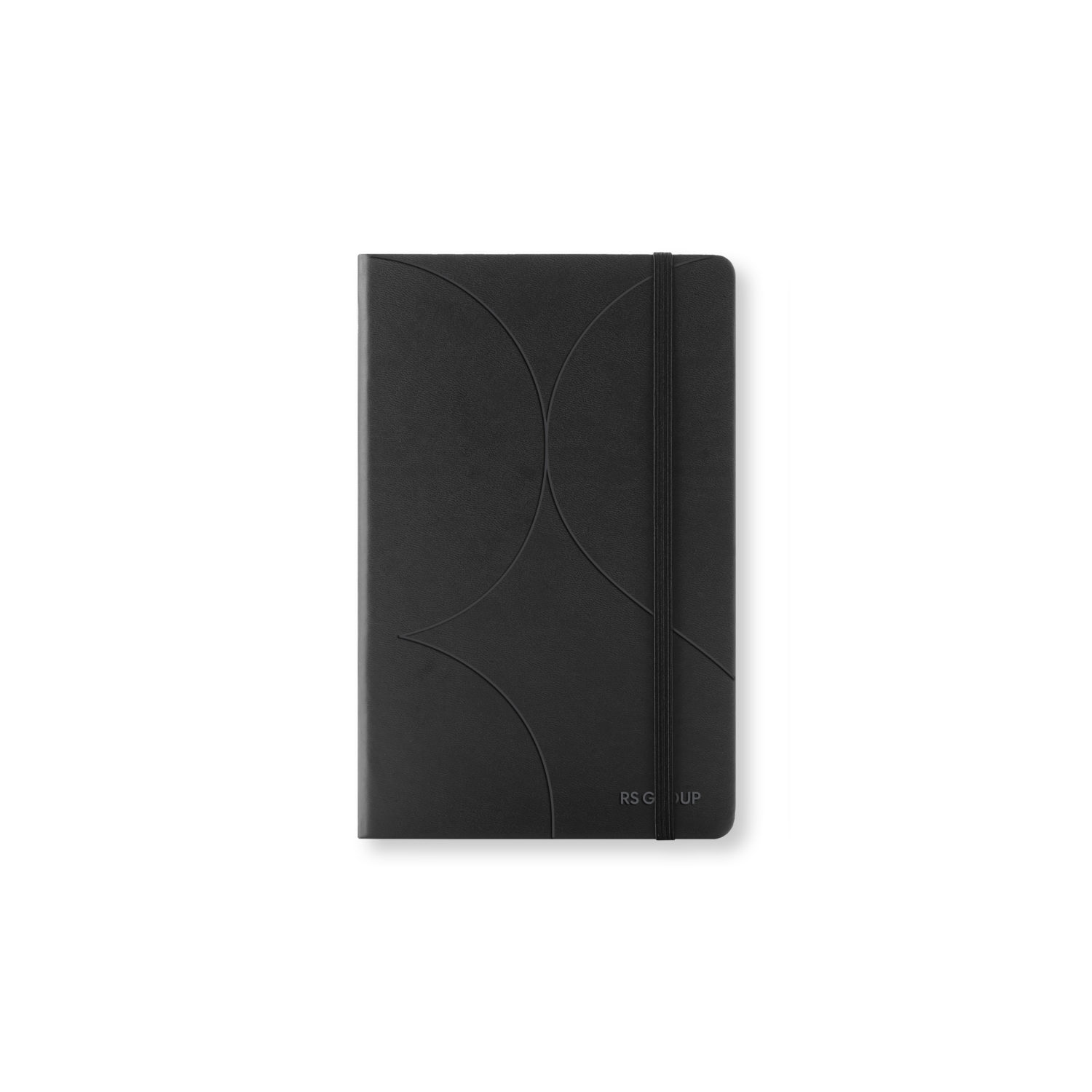
Crafted from a complicated and meticulous designing process, the new RS logo can be easily applied with light, shadow, pictures, and words yet maintain its memorability. Also, the logo is very simple to draw, reflecting RS characteristics as a modern business that blends easily with the environment, adapts itself quickly, and has no fear for any challenges or disruption. It precisely serves the company’s motto “Passion to Win”.

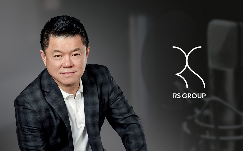
Mr. Surachai Chetchotisak, Chief Executive Officer, said “RS Group has no limit, no color, and no border. The new logo can be either black or white letters. The interesting characteristic is that the letters R and S are linked, reflecting the interconnection between our strong entertainment business and the growing commerce sector. No matter where the logo is placed, everyone can still identify the letters R and S. Likewise, we are ready to step into every industry whether there is an opportunity. Wherever we go, we still keep the characteristic working style of RS that everyone is familiar with. We will follow our mission to inspire and fulfill people with valuable entertainment and solutions.”
RS Group believes that the logo is not the symbol or signature of the brand, but it also reflects the corporate’s creativity and professionalism. Most importantly, the logo needs to be flexible and adaptable but still reserves its original identity as the creator of entertainment culture who steps beyond its limit. We are creating value out of our expertise to satisfy the lifestyle and happiness of viewers and audiences like we have been doing for decades.
Follow more stories and updates of RS Group at www.rs.co.th and Facebook RS Group.

